Alright, folks, let’s talk about that Kamala Harris poster I’ve been working on. It’s been a bit of a journey, so I thought I’d share my process with you all.
I started off by just brainstorming. What did I want this poster to say? Who was I trying to reach? I did some digging into her background – you know, she ran for president in 2020 but didn’t quite make it. And she’s got some interesting policy proposals on stuff like abortion, guns, and voting rights. I also found out about her plans to help out small businesses and give tax breaks to the middle class. It was all pretty interesting stuff.
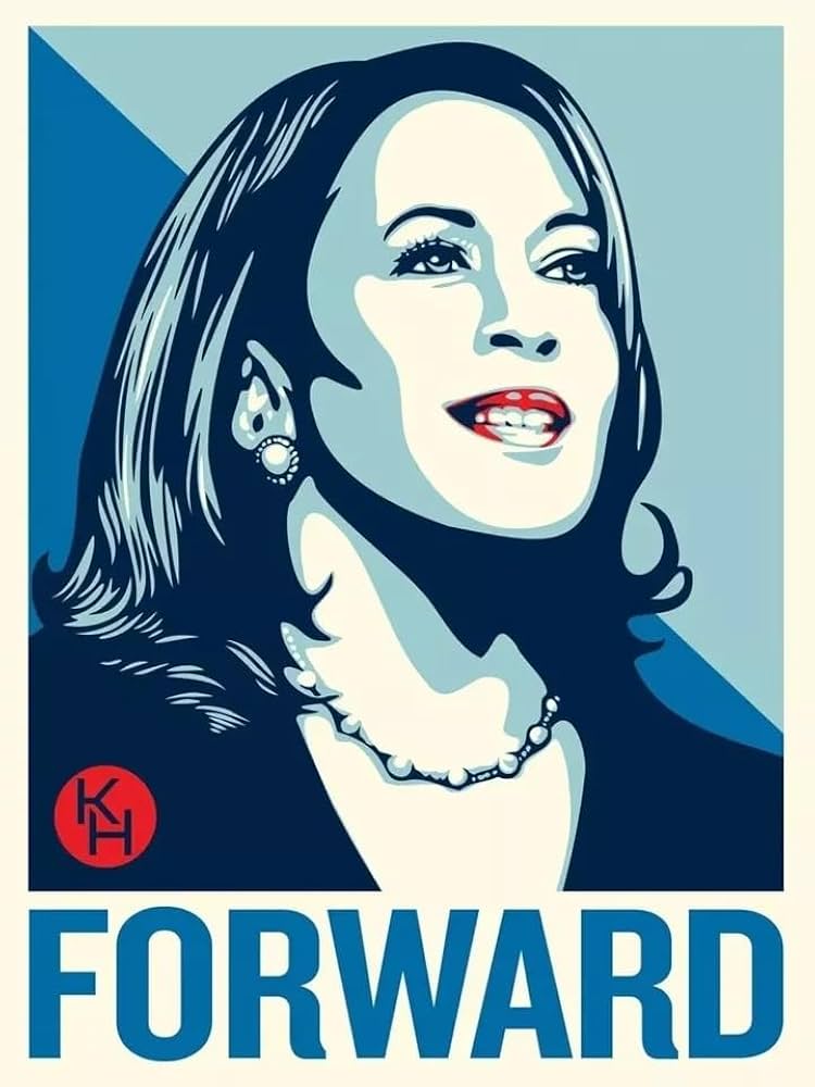
Then, I came across this cool poster by Shepard Fairey, the guy who did Obama’s “Hope” poster. It’s called “Forward,” and it’s got Kamala in these shades of blue. That got me thinking about the design aspect. I’m no artist, but I started playing around with some free online tools to create posters. I tried different layouts, fonts, and colors, just to see what felt right.
Design Attempts
- First Try: I went with a bold, red-white-and-blue color scheme. I used a picture of her smiling, looking all confident. I put her name in big, block letters at the top and added a slogan at the bottom: “For the People.” It was okay, but it felt a bit generic.
- Second Try: This time, I tried something a bit more artistic. I used a black-and-white photo and added some splashes of color. I played around with the typography, using a more handwritten style font. I added some of her policy ideas around the edges like she wants tax credits to provide relief to middle class. It looked cooler, but it was a bit too busy, and it was hard to read.
- Third Try: I decided to simplify things. I used a clean, minimalist design with just a headshot of Kamala and her name. I used a simple, sans-serif font and a blue color scheme, inspired by Fairey’s poster. I added a subtle tagline: “A New Chapter.” This one felt the most “her” – strong, focused, and forward-looking.
I kept tweaking and refining the design, getting feedback from friends and family. It was a lot of trial and error, but I finally landed on something I was happy with. It’s a simple, yet powerful design that I think captures Kamala’s spirit and message.
This whole process was a learning experience for me. I learned more about Kamala Harris, her policies, and her vision for the country. I also learned a bit about graphic design and the power of visual communication. It was a fun project, and I’m excited to see how people react to the poster. I just put it up in my local coffee shop. We’ll see what happens!